JENNIFER’S
BODY
Entertainment Design, Logo Design, Key Art, Advertising
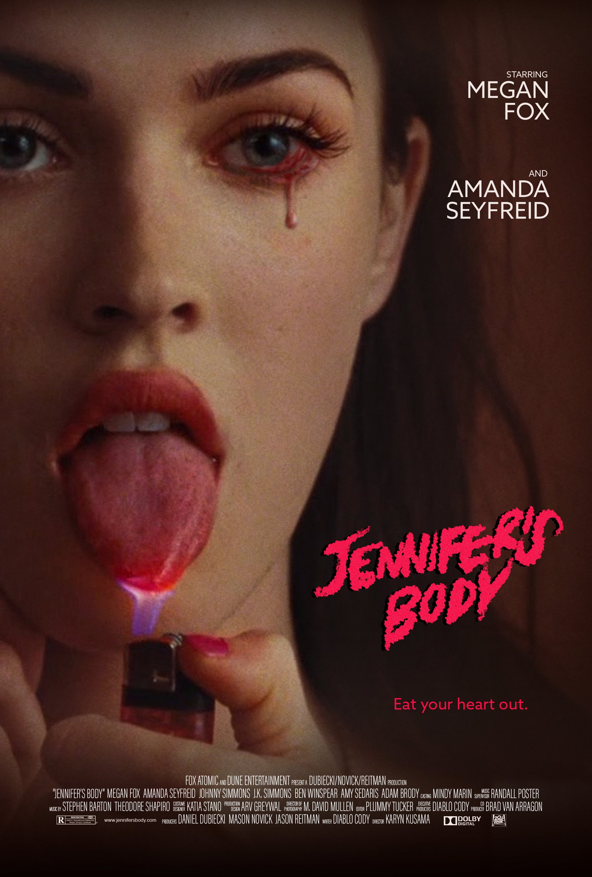
The current logo and key art for the 2009 film Jennifer’s Body is not the most effective and appropriate for a new release of the film. This film is a horror comedy which primarily focuses on the friendship between the two main characters, high schoolers Jennifer and Needy, specifically after Jennifer turns into a succubus, a monster who seduces and feasts on boys.
project
The updated design for Jennifer’s Body, including the logo, key art and advertising design, is much more effective in portraying the balance between horror and more light-hearted comedy, and evoking the snarky, sharp, and satirical tone of the film.
solution
Lead Designer
role
Adobe Photoshop, Adobe Illustrator, Procreate
tools
Process
In looking at the original key art and advertising for the film, type choices are outdated, and Fox is heavily sexualized. While this is an element of the film, it is also satirical and subversive, and this entirely sexual depiction does not properly portray the narrative of the film.
Original Key Art
Original Advertising
Moodboard
Concepts
Through my sketches, I explored different movie poster sells, the star sell, concept sell, and story sell. While I landed on three ideas to explore further, I chose my star sell to move fowards with.
The image I used is an iconic moment from the movie, with Jennifer lighting her tongue on fire casually. This, combined with the bloody tear I illustrated coming from her eye, gives a sense of something non human, which Jennifer no longer is. This image also subverts the overly sexual nature of the original cover art, and lends itself more to the actual tone of the movie.
For the logo redesign, I did hand lettering with a gritty and raw texture, reminiscent of 80s horror movie logos, but with a more modern feel.


