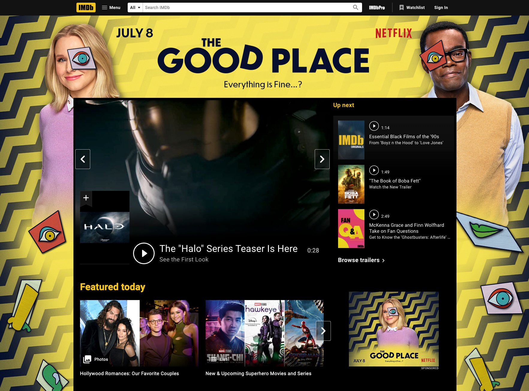
THE GOOD PLACE
Entertainment Design, Logo Design, Key Art, Advertising
The Good Place is a comedy and philosophical fiction show based on the concept of heaven and hell, featuring a quirky cast of characters. The branding doesn’t effectively represent the personality of the show, and the logo does not as well. In this project, I had to redesign the poster for the premiere of the first season of the show.
project
The updated design for The Good Place, including the logo, key art and advertising design, has a bit more personality injected, but still maintains simplicity and cleanness.
solution
role
Lead Designer
tools
Adobe Photoshop, Adobe Illustrator
Process
When redesigning this poster, I ended up drawing a lot of inspiration from specific scenes in the show, such as a scene in which everything goes wrong and everyone but the main character is wearing brightly colored chevron pajamas. This was the first major sign that something was wrong, and what was thought to be the “Good Place” may not be after all… I was inspired by more bold, vector-based graphics in my work, versus the emphasis on photography in the original art.
Old Versus New
In my redesign, I aimed to use graphic elements to indicate that something is not quite right, without giving away the plot. The chevron background feels like a warning sign, and the glitching, Picasso-esque eye is also obviously out of place. The logotype is still simplistic, but the D being slightly off evokes the same feeling as the other elements, and lastly, the tagline encompasses it all.


